


Choose the color palette for your new floor plan design like a pro. It's easier than you think! The colors chosen for each room can influence your mood and are usually a direct reflection of your personality. Going back to the basics is the best place to start when thinking about a color scheme for your new house plan. Let's talk color theory. The color wheel is a wonderful resource that helps us identify primary and secondary colors, as well as complementary and analogous colors. Understanding the color wheel will help create a color palette that works well together. Complementary colors are those that appear opposite on the color wheel. For example, the wheel below demonstrates how red and green, or blue and orange compliment each other. These complimentary pairings create vibrant results and are great choices when you want your space to make a statement. Analogous colors are those that are located next to each other. Pairing these colors in a space creates visual harmony and are guaranteed to work from a design perspective. Tints (the mixture of a color with white) and shades (the mixture of a color with black) are important to consider when you're choosing your palette. Whether you're after a bright and energetic space, or a more subtle hint of color the possibilities are endless.
Colors in Your Home
Choosing a color palette can be intimidating for beginners since color has the power to completely transform the feel of a space. When selecting colors for your home, take into consideration how the colors will affect your mood and what their effect on your space will be.
Red
The color red is the most bold, striking color on the color wheel. It stimulates the senses and gives off a warm vibe. Red can be utilized in a couple of different ways depending on the architectural style and interior design of your home. The first way to utilize red in a space is by painting the walls. Red walls are an excellent choice when the goal is to create a very elegant and traditional space. Alternatively, red can be used as an accent color in furnishings or accessories to give a neutral, modern space some warmth and personality.
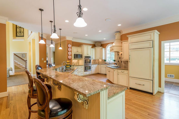
Orange
The color orange evokes enthusiasm and excitement. This energetic color is thought to encourage social interaction so it's typically recommended for social spaces in the home or exercise rooms. While red is commonly associated with increasing appetite, orange is thought to be just as stimulating and is often incorporated into kitchens. The saturation of color will determine the intensity of the psychological qualities you feel, and while this color isn't for everyone it's a great option for those who enjoy vibrancy in their space.
Yellow
The color yellow gives a sense of happiness and cheer. Incorporating yellow into your home can be done in multiple ways. A bright and cheery yellow works best as an accent color in accessories and furnishing. Large amounts can become overwhelming. Less saturated versions of the color are wonderful wall colors, especially in kitchens, living room, and small spaces.

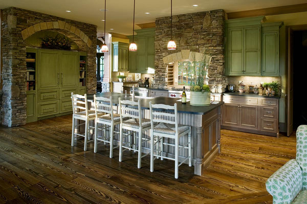
Green
The color green evokes peacefulness, balance, and harmony. This versatile color combines the joyousness of yellow and the refreshing quality of blue. Green is thought to have a calming effect when used as the primary color in a space, and works in almost every room of the house. Vibrant and energizing greens work wonderfully as pops of color in a neutral modern space. Shades and tints of green reminiscent of nature are more calming and help bring the outdoors in.
Blue
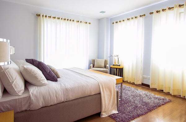
The color blue brings a sense of calmness and freshness to any space. Blue reduces stress and evokes feelings we experience when looking at the ocean or sky. Pastel blues create a cooler atmosphere when used as the primary color, while a warmer or brighter blue creates a more calming effect. Darker shades of blue can evoke sadness and are often recommended as accent colors. Blue is versatile, but works best in bathrooms, bedrooms, and entertainment areas.
Violet (Purple)
The color violet, or purple, is rich, dramatic, and elegant. It is often associated with royalty and luxury, and tends to work best as an accent or secondary color. Lighter versions of violet lend themselves to children's spaces. It creates a sense of serenity similar to the way blue would.
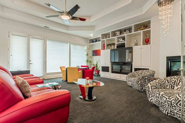
Neutrals (white, gray, brown, black)
Neutral colors are fantastic choices to create a timeless interior space that is flexible over the years. These basic tints and shades allow pops of color to be introduced to liven a room up, or removed to create calmness and tranquility.
What are your favorite colors, and how do you plan on incorporating them into your new home?


